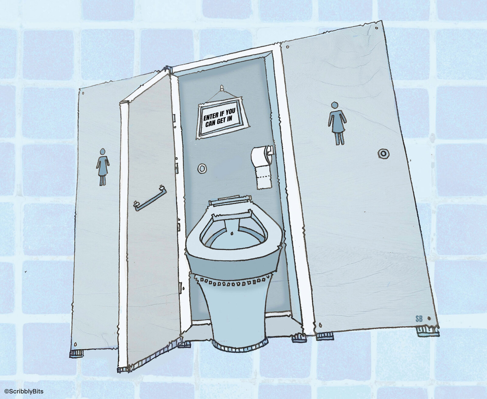
Speaking as both a client and an occupier, I never cease to be disappointed by bad bathroom design in office buildings. I will always remember the city letting agent who once told me, “There are only three things that matter: lobby, loos and views”. In my experience, architects obsess about the first, largely ignore the second, and can’t do a damn thing about the third.
This may be a gross generalisation, but I suspect that most toilets in office buildings are specified by male architects. I say this because female toilets are rarely fit for purpose. I am also convinced that though architects are concerned about how toilets look on plan or in elevation, they rarely (if ever) consider the fact that the minute they hand over the building, the property manager (usually male) will come along and insert accessories such as sanitary bins, toilet brushes and even over-sized toilet paper dispensers.
Speaking as a woman, there are some very basic commandments that should be adhered to when designing office loos.
Thou shalt put a coat hook on the back of the stall door
And preferably, you won’t specify a coat hook that protrudes enough so that when the stall door is banged open, the hook punctures the stall partition which has been value engineered to flimsiness.
Thou shalt leave sufficient space for a sanitary bin
There is nothing more off-putting than sitting down on the toilet and discovering that you are also sitting on the edge of the sanitary bin. That’s not entirely the fault of the architect – the property manager must also bear some blame. But at least ensure that the design allows sufficient room for a bin.
Thou shalt make the stall deep enough
It’s extremely irritating to open the stall door and discover that it just barely squeaks past the toilet, meaning that the only way you can get in and close the door behind you is to squeeze yourself into the space between the wall and the toilet. This is especially awkward if that space has already been taken up by a large (and invariably ugly) sanitary bin.
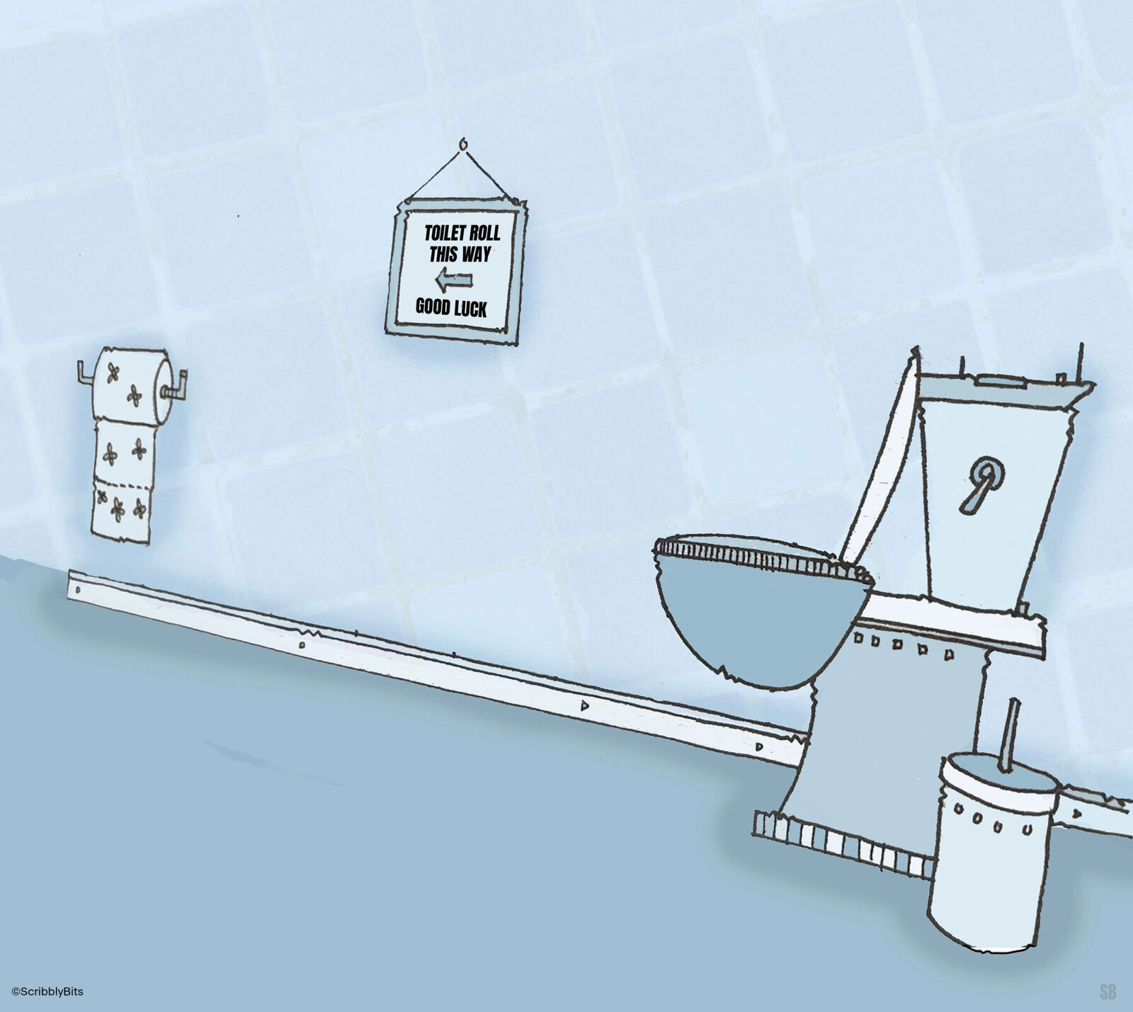
Thou shalt think long and hard about specifying the toilet paper dispenser
The first thing to take into account is that no one wants to have to be a skilled contortionist to reach the loo roll, so make sure the dispenser is placed within easy reach forward of the toilet. The second thing to bear in mind is that the property manager does not want to have to patrol the toilets too frequently to top up the toilet paper, so if you specify a dispenser that only holds one normal size roll, that will instantly be replaced by something else, invariably something ugly and institutional looking.

Thou shalt ensure there is shelf space near the sink for a woman’s handbag
And then make sure you specify a tap design that will not splash onto that surface, because expensive handbags do not like water. And don’t imagine for one instant that a woman will be willing to put her handbag on the floor, because God knows when was the last time it was mopped and how thoroughly.
Thou shalt specify a flush mechanism that will not ruin an expensive manicure
The most obvious solution is to specify an automatic flush, and preferably not one that is so sensitive that it will flush while the user is still sitting on the loo. If a non-electric solution is needed, just don’t specify a button that has to be depressed into the wall. That is virtually guaranteed to break a few nails.
Thou shalt ensure adequate lighting around the mirror
I truly do not understand why anyone designing a toilet thinks that a ceiling fixture that illuminates the top of your head but not your face is of any earthly use. And also, the definition of “adequate lighting” includes the stricture that the lighting should be flattering. This means that yellow fluorescent lights are completely out of the question.

Thou shalt not hide the paper towel dispenser
I’ve been in lots of toilets where the paper towel dispenser has been hidden behind the mirror in between the sinks, but with no signage or other clue as to its location. And by the way, locating it between the sinks means that water will inevitably puddle on the counter, thus breaking the commandment relating to handbags. Architects also need to think about where to install hand dryers so that you don’t drip water halfway across the bathroom in search of the dryer.
Thou shalt design the layout to include a full-length mirror
How else can you check that you don’t have a strip of toilet paper hanging from the back of your outfit?
Thou shalt specify good ventilation to the toilets
Because if you don’t, they will smell. The property manager will then install a deodoriser that will simply overlay the smell of roses/strawberry/vanilla. So even if you’ve got everything else right, the toilets will be a failure.
I have no doubt some readers will find that I have overlooked a key design feature that should be added to this list, and I positively welcome your feedback which you can send through to sara.f@apt.london
Illustrations for this piece were produced by ScribblyBits - you can find more of their work here.


